// Twitter Cards // Prexisting Head The Biologist Is In: math
Showing posts with label math. Show all posts

Friday, February 14, 2020

Tomatillo Breeding (4/n)

The last couple posts have looked at simulations for selection of a single gene, for recessive or dominant alleles. Increasing the number of genes actively under selection results in it taking longer and longer for the population to converge.
Plot titled "Multiple recessive traits, large population", illustrating selection for a trait in an out-crossing population.
Plot titled "Multiple dominant traits, large population", illustrating selection for a trait in an out-crossing population. It takes more years for the trait of interest to reach saturation in the population.
The change in code to simulate multiple genetic loci is really simple if we assume the different alleles we're selecting on are found sufficiently distant from each other on the chromosomes. This is referred to as "un-linked" and means the probability calculations for each are independent of the others.

R Script 5: Multiple recessive traits, large population.
# One recessive trait, infinite population.
#     Stabilize progeny for recessive trait via selection.
#     Save seeds from double-recessive plants each generation.
years <- 10;

# Define F2 population.
P_AA <- vector();
P_Aa <- vector();
P_aa <- vector();
P_AA <- 0.25;
P_Aa <- 0.50;
P_aa <- 0.25;

# Save seeds only from aabb plants, unknown pollen donor. Iterate over years.
for(i in 1:years) {
  P_AA <- append(P_AA,   0);
  P_Aa <- append(P_Aa,   P_aa[i]*P_AA[i]*1.00 + P_aa[i]*P_Aa[i]*0.50);
  P_aa <- append(P_aa,   P_aa[i]*P_aa[i]*1.00 + P_aa[i]*P_Aa[i]*0.50);
  P_sum <- P_aa[i+1] + P_Aa[i+1];
  P_Aa[i+1] <- P_Aa[i+1]/P_sum;
  P_aa[i+1] <- P_aa[i+1]/P_sum;
}

# Make figure.
plot(  0:years, P_aa^1, col="red", main="Multiple recessive traits, large population.", xlab="Years", ylab="%aa pollen donors", xlim=c(0,years), ylim=c(0,1), axes=TRUE, frame.plot=TRUE);
lines(0:years, P_aa^1, col="red");
lines(0:years, 1-P_aa^1, col="blue", lty="dashed");
lines(c(0,years),c(0.95,0.95), col="black", lty="dotted");
lines(c(0,years),c(0.99,0.99), col="black", lty="dashed");

for(i in 2:20) {
  lines(0:years, P_aa^i, col="red");
  lines(0:years, 1-P_aa^i, col="blue", lty="dashed");
}

R Script 6: Multiple dominant traits, large population.
# One dominant trait, infinite population.
#     Stabilize progeny for dominant trait via selection.
#     Save seeds from dominant plants each generation.
years <- 10;

# Define F2 population.
P_AA <- vector();
P_Aa <- vector();
P_aa <- vector();
P_AA <- 0.25;
P_Aa <- 0.50;
P_aa <- 0.25;

# Save seeds only from (AA and Aa) plants, unknown pollen donor. Iterate over years.
for(i in 1:years) {
  P_AA <- append(P_AA,   P_AA[i]*P_AA[i]*1.00 + P_AA[i]*P_Aa[i]*0.50 + P_Aa[i]*P_Aa[i]*0.25);
  P_Aa <- append(P_Aa,   P_AA[i]*P_aa[i]*1.00 + P_AA[i]*P_Aa[i]*0.50 + P_Aa[i]*P_aa[i]*0.50 + P_Aa[i]*P_Aa[i]*0.50);
  P_aa <- append(P_aa,   0);
  
  P_sum <- P_AA[i+1] + P_Aa[i+1];
  P_AA[i+1] <- P_AA[i+1]/P_sum;
  P_Aa[i+1] <- P_Aa[i+1]/P_sum;
}

# Make figure.
plot(  0:years, P_AA, col="red", main="Multiple dominant traits, large population.", xlab="Years", ylab="%AA pollen donors", xlim=c(0,years), ylim=c(0,1), axes=TRUE, frame.plot=TRUE);
lines(0:years, P_AA, col="red");
lines(0:years, 1-P_AA, col="blue", lty="dashed");
lines(c(0,years),c(0.95,0.95), col="black", lty="dotted");
lines(c(0,years),c(0.99,0.99), col="black", lty="dashed");

for(i in 2:20) {
  lines(0:years, P_AA^i, col="red");
  lines(0:years, 1-P_AA^i, col="blue", lty="dashed");
}


The probability of an F2 plant having two copies of recessive alleles for multiple genes drops to minimal very quickly when we increase the number of genes. In a small population this low probability means we might not find an F2 with all the recessive alleles stacked up the way we might want. All is not lost.

With our small F2 population, roughly a quarter would be expected to be in the double-recessive condition for the first gene of interest.

25% AA; 50% Aa; 25% aa

If we were unlucky and couldn't find a single plant that was also double-recessive for the second gene of interest, we can go ahead with plants showing the dominant trait for that second gene. The probability is that two thirds of the plants showing the dominant trait for the second gene will be heterozygous, carrying one copy of the recessive allele.

aaB_ (⅓BB; ⅔Bb)

In the next generation we have pretty good odds of recovering that second recessive trait that we were looking for. This way we can progressively collect multiple recessive traits without finding them in that first F2 generation. With this strategy, we need to keep seeds from prior generations. If we can't recover that next recessive trait in the next year, then we managed to find plants that were not heterozygous for the gene of interest. We need to grow more plants from the previous generation again, to try and find some carrying a copy of the recessive allele.


With plants that typically self-pollinate (like peppers and tomatoes), it can be pretty simple to intentionally remove recessive alleles for genes of interest. If you grow out the seeds produced by a plant and find any double-recessive progeny, you know that plant was heterozygous. If you don't find any double-recessive progeny, if you grow enough seeds, you can be pretty confident of that plant being homozygous for the dominant allele.

With plants that can't self-pollinate (like tomatillos), it can take more work/time. Lets say we have one plant that is showing the dominant trait. If we cross it with a plant showing the recessive trait, the resulting progeny will tell us if that first plant is "AA" or "Aa". If all the progeny show the dominant trait, then the plant we were testing is "AA". If the progeny show a mix of dominant and recessive traits, then the plant we were testing is "Aa" (and can be discarded). This is called a "test-cross" because it is used to test the genetics of a specific individual, even though we have no interest in using the progeny that result for further breeding work.

Since tomatilloes can be kept alive over several years, you can use such test crosses to progressively collect multiple plants with just the dominant alleles for your genes of interest. Once you have a few such plants, you can then allow them to inter-cross and be confident you won't have the recessive allele turning up in the next generations.

Friday, February 7, 2020

Tomatillo Breeding (3/n)

I've been doing some math to help me think about breeding strategies with tomatillos. Last week I showed some code for calculating how populations of different sizes converge under selection for a single recessive trait. Here I'll show similar code for a single dominant trait.


X-axis, years going from 0 to 10. Y-axis, "%AA pollen donors" going from 0 to 1. Red curve for %AA goes from lower left, rises slowly towards 1, and then smooths out to approach 1. Blue curve descends in a mirror image.
Solid red curve with circles: %AA pollen donors.
Dashed blue curve: %Aa & %aa pollen donors.
Like before, we'll start with an infinite population.

Since we can't tell the difference between plants with one or two copies of the dominant trait ("AA" or "Aa"), we can't tell what the genetic status is of any one plant that we save seeds from. Our goal is a population entirely consisting of "AA" plants, so that is what the code will plot.

The zero year is our F2 population. It takes seven years for the "AA" individuals to represent 95% (dotted horizontal line) of the population. Three years later the level crosses above 99% (dashed horizontal line) of the population.

Because this is the infinite population scenario, there will always be a small percentage of the population carrying the recessive allele.

R Script 3: One dominant trait, infinite population.
# One dominant trait, infinite population.
#     Stabilize progeny for dominant trait via selection.
#     Save seeds from dominant plants each generation.
years <- 10;

# Define F2 population.
P_AA <- vector();
P_Aa <- vector();
P_aa <- vector();
P_AA <- 0.25;
P_Aa <- 0.50;
P_aa <- 0.25;

# Save seeds only from (AA and Aa) plants, unknown pollen donor. Iterate over years.
for(i in 1:years) {
  P_AA <- append(P_AA,   P_AA[i]*P_AA[i]*1.00 + P_AA[i]*P_Aa[i]*0.50 + P_Aa[i]*P_Aa[i]*0.25);
  P_Aa <- append(P_Aa,   P_AA[i]*P_aa[i]*1.00 + P_AA[i]*P_Aa[i]*0.50 + P_Aa[i]*P_aa[i]*0.50 + P_Aa[i]*P_Aa[i]*0.50);
  P_aa <- append(P_aa,   0);
  
  P_sum <- P_AA[i+1] + P_Aa[i+1];
  P_AA[i+1] <- P_AA[i+1]/P_sum;
  P_Aa[i+1] <- P_Aa[i+1]/P_sum;
}

# Make figure.
plot(  0:years, P_AA, col="red", main="One dominant trait, large population.", xlab="Years", ylab="%AA pollen donors", xlim=c(0,years), ylim=c(0,1), axes=TRUE, frame.plot=TRUE);
lines(0:years, P_AA, col="red");
lines(0:years, P_Aa+P_aa, col="blue", lty="dashed");
lines(c(0,years),c(0.95,0.95), col="black", lty="dotted");
lines(c(0,years),c(0.99,0.99), col="black", lty="dashed")

X-axis, years going from 0 to 10. Y-axis, "%target Pollen Donors" going from 0 to 1. Cyan curve for recessive percentage goes from lower left, rises sharply towards 1, and then smooths out to approach 1. Red curve for dominant percentage goes from lower left, rises slowly towards 1, and then smooths out to approach 1. Yellow curve descends in a mirror image of cyan curve. Blue curve descends in a mirror image of red curve.
Cyan line w/circles: recessive selection.
Red line w/circles: dominant selection.
To compare the trajectory for selection on the recessive allele vs on the dominant allele, I overlaid the two curves in an image editor. I inverted the colors for the recessive curves to better distinguish them from the added dominant curves.

Selection on a dominant trait progresses at a slower rate initially than selection on a recessive trait, but by about ten years the two approaches would be expected to reach a similar degree of completeness.

With smaller population sizes, we'd expect the selected allele (dominant or recessive) to reach complete saturation by about that time point.


With recessive traits, I only had to consider "aa" plants as seed producers. With dominant traits, I have to consider "AA" and "Aa" plants. This seems like a small difference, but for simulating small numbers this adds significant complexity.

Similar to above figure, but each curve is replaced by a tight cluster of overlapping curves representing individual runs of the simulation.
Population = 1000
Similar to above figure, but each curve is replaced by a very loose cluster of overlapping curves representing individual runs of the simulation.
Population = 50
Similar to above figure, but each curve is replaced by an extremely loose cluster of overlapping curves representing individual runs of the simulation. These curves occupy almost the entire figure.
Population = 10

If you compare these plots to those for the recessive selection scenario (https://the-biologist-is-in.blogspot.com/2020/01/tomatillo-breeding-2n.html), you'll see that this scenario has a much higher level of noise in the trajectories. For the smallest population level, it takes 30 years (not shown in figures) for the majority of the experimental replicates to converge on the targeted "AA" condition.

R Script 4: One dominant trait, small population.
# One dominant trait, small population.
#     Stabilize progeny for dominant trait via selection.
#     Save seeds from dominant plants each generation.
years <- 10;
population <- 1000; # 1000, 50, 10
trials <- 100;

# Intialize figure.
plot( c(0,years),c(0,years), col="red", main="One dominant trait, small population.", xlab="Years", ylab="%AA pollen donors", xlim=c(0,years), ylim=c(0,1), axes=TRUE, frame.plot=TRUE);
lines(c(0,years),c(0.95,0.95), col="black", lty="dotted");
lines(c(0,years),c(0.99,0.99), col="black", lty="dashed");

for (ii in 1:trials) {
  # Define F2 population probabilities for selection on AA plants.
  P_AA_1 <- vector();
  P_Aa_1 <- vector();
  P_aa_1 <- vector();
  P_AA_1 <- 0.25;
  P_Aa_1 <- 0.50;
  P_aa_1 <- 0.25;
  
  # Define F2 population probabilities for selection on Aa plants.
  P_AA_2 <- vector();
  P_Aa_2 <- vector();
  P_aa_2 <- vector();
  P_AA_2 <- 0.25;
  P_Aa_2 <- 0.50;
  P_aa_2 <- 0.25;

  # Save seeds only from (AA and Aa) plants, which can't self-polinate.
  for (i in 1:(years+2)) {
    # Generate actual population.
    rands <- runif(population, 0, 1);
    Genotypes <- vector();
    for (j in 1:population) {
      if (rands[j] < P_AA_1[i]) {
        Genotypes <- append(Genotypes, "AA");
      } else if (rands[j] < P_AA_1[i]+P_Aa_1[i]) {
        Genotypes <- append(Genotypes, "Aa");
      } else {
        Genotypes <- append(Genotypes, "aa");
      }
    }
    Genotype_counts <- table(Genotypes);
    
    # Determine actual genotype probabilities for pollen donors. (Assuming "AA" plant in case 1, "Aa" plant in case 2.)
    if (is.na(Genotype_counts["AA"])) {
      P_AA_1[i] <- 0;
      P_AA_2[i] <- 0;
    } else {
      P_AA_1[i] <- (Genotype_counts["AA"]-1)/(population-1); # The plant we're saving seeds from can't be polinated by itself.
      P_AA_2[i] <- Genotype_counts["AA"]/(population-1);
    }
    if (is.na(Genotype_counts["Aa"])) {
      P_Aa_1[i] <- 0;
      P_Aa_2[i] <- 0;
    } else {
      P_Aa_1[i] <- Genotype_counts["Aa"]/(population-1);
      P_Aa_2[i] <- (Genotype_counts["AA"]-1)/(population-1); # The plant we're saving seeds from can't be polinated by itself.
    }
    if (is.na(Genotype_counts["aa"])) {
      P_aa_1[i] <- 0;
      P_aa_2[i] <- 0;
    } else {
      P_aa_1[i] <- Genotype_counts["aa"]/(population-1);
      P_aa_2[i] <- Genotype_counts["aa"]/(population-1);
    }
  
    # Generate new theoretical genotype probabilities.
    P_AA_1 <- append(P_AA_1,   P_AA_1[i]*P_AA_1[i]*1.00 + P_AA_1[i]*P_Aa_1[i]*0.50 + P_Aa_1[i]*P_Aa_1[i]*0.25);
    P_Aa_1 <- append(P_Aa_1,   P_AA_1[i]*P_aa_1[i]*1.00 + P_AA_1[i]*P_Aa_1[i]*0.50 + P_Aa_1[i]*P_aa_1[i]*0.50 + P_Aa_1[i]*P_Aa_1[i]*0.50);
    P_aa_1 <- append(P_aa_1,   0);
    
    P_AA_2 <- append(P_AA_2,   P_AA_2[i]*P_AA_2[i]*1.00 + P_AA_2[i]*P_Aa_2[i]*0.50 + P_Aa_2[i]*P_Aa_2[i]*0.25);
    P_Aa_2 <- append(P_Aa_2,   P_AA_2[i]*P_aa_2[i]*1.00 + P_AA_2[i]*P_Aa_2[i]*0.50 + P_Aa_2[i]*P_aa_2[i]*0.50 + P_Aa_2[i]*P_Aa_2[i]*0.50);
    P_aa_2 <- append(P_aa_2,   0);

    P_sum_1 <- P_AA_1[i+1] + P_Aa_1[i+1];
    P_AA_1[i+1] <- P_AA_1[i+1]/P_sum_1;
    P_Aa_1[i+1] <- P_Aa_1[i+1]/P_sum_1;
    
    P_sum_2 <- P_AA_2[i+1] + P_Aa_2[i+1];
    P_AA_2[i+1] <- P_AA_2[i+1]/P_sum_2;
    P_Aa_2[i+1] <- P_Aa_2[i+1]/P_sum_2;
    
    # Weighted average of the two probability sets by proportion of "AA" vs "Aa" plants.
    #  Only _1 values carry over to next iteration.
    if (is.na(Genotype_counts["AA"])) {
      count_AA <- 0; } else {
      count_AA <- Genotype_counts["AA"];
    }
    if (is.na(Genotype_counts["Aa"])) {
      count_Aa <- 0; } else {
      count_Aa <- Genotype_counts["Aa"];
    }
    weight1 <- count_AA/(count_AA+count_Aa);
    weight2 <- 1-weight1;
    val_AA_1 <- P_AA_1[i+1];
    val_AA_2 <- P_AA_2[i+1];
    val_Aa_1 <- P_Aa_1[i+1];
    val_Aa_2 <- P_Aa_2[i+1];
    P_AA_1[i+1] <- val_AA_1*weight1 + val_AA_2*weight2;
    P_Aa_1[i+1] <- val_Aa_1*weight1 + val_Aa_2*weight2;
    
    if (is.na(P_AA_1[i+1]) == TRUE) {  P_AA_1[i+1] <- 0;  }
    if (is.na(P_Aa_1[i+1]) == TRUE) {  P_Aa_1[i+1] <- 0;  }
    
    if ((P_AA_1[i+1]+P_Aa_1[i+1]) == 0) {
      # End simulation cycle if no "AA" or "Aa" plants.
      for (j in (length(P_aa_1)):years) {
        P_AA_1 <- append(P_AA_1,   0);
        P_Aa_1 <- append(P_Aa_1,   0);
        P_aa_1 <- append(P_aa_1,   0);
      }
      break;
    }
    
    ## Debugging output.
    #message("Iteration ", i);
    #print(Genotypes);
    #message("  ");
  }

  # Add current simulation cycle to figure.
  points(0:years, P_AA_1[1:(years+1)], col="red");
  lines( 0:years, P_AA_1[1:(years+1)], col="red");
  lines( 0:years, 1-P_AA_1[1:(years+1)], col="blue", lty="dashed");
}


This essentially means it isn't possible to selectively breed a dominant trait to complete saturation in a small population just using simple selection.

Unlike in the recessive case, we can't just save a few plants over winter to reset the population with only the exact genetics we want. A similar strategy should allow for more rapid progress towards the goal, however.

I'll explore this topic further next time.

Friday, January 31, 2020

Tomatillo Breeding (2/n)

I thought it would take me a week to get back to this, but that didn't happen. Oops. Sorry.


The big difficulty with tomatillo breeding is that they're very strong out-crossers. Unlike tomatoes, peppers, eggplant, beans, etc., you can't just grow one plant from each generation to help reduce control the genetics during the process of making a new variety. If you grow a dozen tomatillo plants and don't like how half of them grew, you can be sure that seeds saved from the plants you liked will have genetics from the ones you didn't.

I worked out some of the math long-hand, showing how this difficulty plays out over several generations. I faltered when it came to the task of outlining all those calculations via text. It is easy enough to throw a few equations into text, but I didn't want to post pages of derivations for you to read through. (And I'd have most assuredly made silly typos along the way.)

Instead, I wrote up some simulations in R. These can be run using RStudio if you want to play around with them, or you can just look at my summary figures here.


X-axis, years going from 0 to 10. Y-axis, "%aa pollen donors" going from 0 to 1. Red curve for %aa goes from lower left, rises rapidly towards 1, and then smooths out to approach 1. Blue curve descends in a mirror image.
Solid red curve with circles: %aa pollen donors.
Dashed blue curve: %Aa & %AA pollen donors.
We'll start with the simple case of a single recessive trait in an infinite population. (Sometimes infinity makes the math hard to do, other times it makes it very easy.)

If we seeds only from plants showing the recessive trait, we can rapidly select away the dominant allele. The zero year of this plot is the F2 generation, where traits first start assorting. It takes five years for the recessive trait to be at 95% (dotted horizontal line) of the population and another three for it to be at 99% (dashed horizontal line) of the population.

Because the population is infinite, we can never quite reach 100%. There will always be a small amount of the dominant allele hanging around.

R Script 1: One recessive trait, infinite population.
# One recessive trait, infinite population.
#     Stabilize progeny for recessive trait via selection.
#     Save seeds from double-recessive plants each generation.
years <- 10;

# Define F2 population.
P_AA <- vector();
P_Aa <- vector();
P_aa <- vector();
P_AA <- 0.25;
P_Aa <- 0.50;
P_aa <- 0.25;

# Save seeds only from aa plants, unknown pollen donor. Iterate over years.
for(i in 1:years) {
  P_AA <- append(P_AA,   0);
  P_Aa <- append(P_Aa,   P_aa[i]*P_AA[i]*1.00 + P_aa[i]*P_Aa[i]*0.50);
  P_aa <- append(P_aa,   P_aa[i]*P_aa[i]*1.00 + P_aa[i]*P_Aa[i]*0.50);
  P_sum <- P_aa[i+1] + P_Aa[i+1];
  P_Aa[i+1] <- P_Aa[i+1]/P_sum;
  P_aa[i+1] <- P_aa[i+1]/P_sum;
}

# Make figure.
plot(  0:years, P_aa, col="red", main="One recessive trait, large population.", xlab="Years", ylab="%aa pollen donors", xlim=c(0,years), ylim=c(0,1), axes=TRUE, frame.plot=TRUE);
lines(0:years, P_aa, col="red");
lines(0:years, P_Aa+P_AA, col="red", lty="dashed");
lines(c(0,years),c(0.95,0.95), col="black", lty="dotted");
lines(c(0,years),c(0.99,0.99), col="black", lty="dashed")


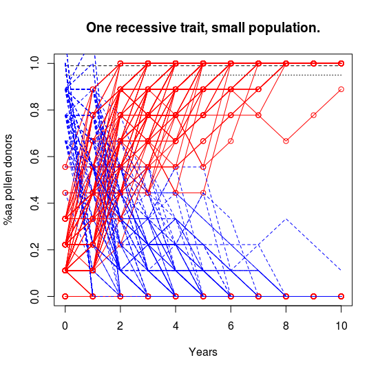
We can extend this simulation to better model a realistic situation where you can only grow a limited number of plants. Coding this is much more complicated. If we run it with a large population, we see a pattern much like the infinite one above. If we run it with a small population, we get very noisy trajectories that vary a lot from run to run. At small population numbers, it is fairly easy to accidentally end the experiment with no "aa" plants to save seeds from. (In real life, we'd just go back to seeds from the previous generation.)

Similar to above figure, but each curve is replaced by a tight cluster of overlapping curves representing individual runs of the simulation.
Population = 1000
Similar to above figure, but each curve is replaced by a loose cluster of overlapping curves representing individual runs of the simulation.
Population =50
Similar to above figure, but each curve is replaced by a very loose cluster of overlapping curves representing individual runs of the simulation. The curves are so noisy that the cluster is spread over much of the plot.
Population =10

The upshot of the simulations is that if we grow small numbers of plants each generation, we can eventually eliminate the pesky dominant alleles for the trait of interest. It will take a while, but it is doable if you're willing to wait several years to a decade.

R Script 2: One recessive trait, small population.
# One recessive trait, small population.
#     Stabilize progeny for recessive trait via selection.
#     Save seeds from double-recessive plants each generation.
years <- 10;
population <- 50; # 1000, 50, 10
trials <- 100;

# Intialize figure.
plot(  c(0,years),c(0,years), col="red", main="One recessive trait, small population.", xlab="Years", ylab="%aa pollen donors", xlim=c(0,years), ylim=c(0,1), axes=TRUE, frame.plot=TRUE);
lines(c(0,years),c(0.95,0.95), col="black", lty="dotted");
lines(c(0,years),c(0.99,0.99), col="black", lty="dashed");

for (ii in 1:trials) {
  # Define F2 population probabilities
  P_AA <- vector();
  P_Aa <- vector();
  P_aa <- vector();
  P_AA <- 0.25;
  P_Aa <- 0.50;
  P_aa <- 0.25;

  # Save seeds only from "aa" plants, which can't self-polinate.
  for (i in 1:(years+2)) {
    # Generate actual population.
    rands <- runif(population, 0, 1);
    Genotypes <- vector();
    for (j in 1:population) {
      if (rands[j] < P_AA[i]) {
        Genotypes <- append(Genotypes, "AA");
      } else if (rands[j] < P_AA[i]+P_Aa[i]) {
        Genotypes <- append(Genotypes, "Aa");
      } else {
        Genotypes <- append(Genotypes, "aa");
      }
    }
    Genotype_counts <- table(Genotypes);
    
    # Determine actual genotype probabilities for pollen donors.
    if (is.na(Genotype_counts["AA"])) {
      P_AA[i] <- 0; } else {
      P_AA[i] <- Genotype_counts["AA"]/(population-1);
    }
    if (is.na(Genotype_counts["Aa"])) {
      P_Aa[i] <- 0; } else {
      P_Aa[i] <- Genotype_counts["Aa"]/(population-1);
    }
    if (is.na(Genotype_counts["aa"])) {
      P_aa[i] <- 0; } else {
      P_aa[i] <- (Genotype_counts["aa"]-1)/(population-1); # The plant we're saving seeds from can't be polinated by itself.  
    }
  
    # Generate new theoretical genotype probabilities.
    P_AA <- append(P_AA,   0);
    P_Aa <- append(P_Aa,   P_aa[i]*P_AA[i]*1.00 + P_aa[i]*P_Aa[i]*0.50);
    P_aa <- append(P_aa,   P_aa[i]*P_aa[i]*1.00 + P_aa[i]*P_Aa[i]*0.50);
    
    P_sum <- P_aa[i+1] + P_Aa[i+1];
    P_Aa[i+1] <- P_Aa[i+1]/P_sum;
    P_aa[i+1] <- P_aa[i+1]/P_sum;
    
    if (is.na(P_Aa[i+1]) == TRUE) {  P_Aa[i+1] <- 0;  }
    if (is.na(P_aa[i+1]) == TRUE) {  P_aa[i+1] <- 0;  }
    
    if (P_aa[i+1] == 0) {
      # End simulation cycle if no "aa" plants.
      for (j in (length(P_aa)):years) {
        P_AA <- append(P_AA,   0);
        P_Aa <- append(P_Aa,   0);
        P_aa <- append(P_aa,   0);
      }
      break;
    }
  }

  # Add current simulation cycle to figure.
  points(0:years, P_aa[1:(years+1)], col="red");
  lines( 0:years, P_aa[1:(years+1)], col="red");
  lines( 0:years, 1-P_aa[1:(years+1)], col="blue", lty="dashed");
}


However, there's a much faster way to complete the process. It might even only take a couple years.

Tomatilloes are perennial where it is warm enough for them to survive through winter. They also easily root from cuttings. These traits combined mean we can pot up rooted cuttings from each plant at the end of one year and continue growing selected plants the next year after we've had a chance to evaluate their fruit characteristics.

You'd have to grow enough plants the first year to be able to find multiple individuals with the recessive traits you're interested in. The next year, you can continue growing only those few plants and allow them to cross-pollinate. Every seed they produce in their second year will contain those recessive traits you selected the parents for. The dominant alleles will be gone from your population.

You're done in one year of selection and another for seed production. No waiting around for a decade or more, gambling with the whims of chance. You may have your new tomatillo variety complete and ready to go.


I didn't talk about dominant traits here. They're a bit more involved and I'll have to do another post about that case. I'll also have to do another post talking about the case where you're looking for multiple specific genes (recessive or dominant) at once.

It looks like my planned two part series is going to be a bit longer in the end.

Monday, December 24, 2018

Mathematical Recreations : Ramanujan's Nested Radical 4

I've previously discussed an interesting math problem posed by Srinivasa Ramanujan way back in 1911.

Over the last three posts on the topic, I've explored my thoughts about this problem and then proved there are an infinite number of valid solutions (any value greater than three).

Since then I've been trying to figure out how to prove all values less than three are not valid solutions. I haven't figured out how to do this yet, but I have figured out how to prove a subset of values are not valid solutions. Any trajectory which reaches zero will then pass to less than zero and be invalid. I might formalize this statement once I've figured out if it can help me finish the overall solution. It might just be a blind alley...


I haven't found anyone else working this problem in the way I have been. The closest I've found has been some comments below a YouTube video where a user talked about calculating through trajectories like I have been. They didn't suggest any sort of general solution to the problem, however.

I did find a mathematical paper using Ramanujan's solution to the problem as part of the title. The authors and reviewers of the paper assumed Ramanujan was correct and didn't test their assumption. I'm considering writing them a letter...


References:

Monday, July 16, 2018

Seashell Simulation

Cover image of book, "The Algorithmic Beauty of Sea Shells", with a single large patterned shell at center.
(Book image from large online vendor.)
I've decided it's about time I did a book review. The book is probably not going to already be on your reading list. You are likely to have never heard of it and if you brought it up at a party, I don't expect you'd see a glimmer of recognition among your conversational targets. That said, I think it is a important book because it approaches an interesting topic in biology in a different way than most biology books and in doing so may reach an audience which normally wouldn't connect with biology books.

The book is: "The Algorithmic Beauty of Sea Shells", by Hans Meinhardt (ISBN 3-540-44010-0). I own a copy of the third edition in English. The first version was printed in 1995 in Germany.


At first glance, the book appears to be about how the patterns on sea shells are formed. The book talks very little about molluscs, however. In the first chapter, Meinhardt introduces us to the idea of dynamical systems and how they're involved everywhere in the origin of patterns in the world we live in. From sand dunes to fern leaves, everything we see is a snapshot of a dynamical system. He then goes on to introduce seashell patterns as the history of a complicated dynamic system that played out over the life of the animal.

Chapters 2-9 develop an increasingly detailed mathematical model describing more and more complex patterns found on seashells. You don't have to be able to follow the math to follow the discussion. There are lovely photos and images from the author's computer simulations at every turn. However, if you are interested in the math, the essentials are laid out for you to explore. This detailed mathematical description of the biology is what is often lacking in biology books and what may attract the interest of people who normally would shy away from the "soft-science" that biology is often perceived to be.

Chapter 10 discusses efforts to mathematically model the shapes of seashells. Again, the math is only written out lightly and there are numerous figures illustrating the efforts that have come out of the research into the subject.

Chapter 11 introduces a computer program the author wrote to generate the many simulations illustrated throughout the book. The software comes with the book in the form of a CD-ROM and can can be run on any modern computer using DOSBox, an emulator of the DOS operating system on an x86 computer. This chapter can be entirely ignored if you're not interested in the software.

Chapter 12 takes the lessons learned in chapters 2-9 and applies them in a simplified way to the more complicated biology that is responsible for how plants, animals, and other organisms develop. If you're interested in how the bones of chicken wings (or our arms) are laid out, this is the chapter that might gain your interest. The topics discussed here are much less worked out than the detailed analysis of how seashell patterns are formed.

When I first came upon this book, I was already a biology student at university who also did extensive computer programming. and math. The book spoke to me in a way that no biology book had done before. If you are interested in math as applied to biology, or in how you can convince computers to do complex math, this book will probably be of great interest to you. If you are interested in the complexities of biology and how we can approach the beginnings of an understanding about them, this book will probably be of great interest to you. If you have no interest in math or biology, then this book will probably not be for you. (Also. What are you doing here at this blog?)


Simulation image of complicated shell-inspired pattern, with white/black/red/green colors.
I found the software included with the book to be clunky and slow. It is written in basic and run through a slow interpreter. I decided it would be fun and educational to re-implement the software in a faster language. I was using Turbo Pascal and so began writing. After several years, during which many other things took up most of my time, I had written a program which replicated much of the original software.

The figure at right is from my own software. It takes about 1% of the time to compute as it did in the original program, so it is much easier to play around with generating many different versions. Unfortunately, my program isn't yet complete. There are numerous simulations where my output doesn't quite match the author's. Whenever I am able to dedicate some time to working on this project, I find I am able to resolve more issues, but it will still take some time yet before I am "done".

Eventually, I'd like to write up a detailed description of what I learned while re-implementing the software. If I found the time, I'd like to extend the software in new directions. I've done some initial work towards simulating more realistic 2d clusters of cells, but without any of the complicated math needed for pattern generation. I'd like to explore the evolutionary dynamics that can lead to complex pattern formation. (Things like the various forms of mimicry and what not.) For now, I've put up the various figures I've generated at my Flickr account.


References:

Monday, February 19, 2018

A Bird's View of Color

Diagram illustrating the frequency sensitivity of three photoreceptors in humans and four photoreceptors in starlings.
Figure from [link].
Most birds have much better color vision than mammals. In general, they have four distinct types of color-sensing cones in their eyes, compared to the usual three for us and two for most other mammals. The fourth cone that birds have is sensitive to ultraviolet (UV), letting them perceive colors we can only imagine. The other three cones don't precisely match up with our three, but they cover basically the same range of frequencies.

To get an idea of what things look like to birds, we have to incorporate that UV information we can't see. Taking photographs of the UV world can take some special equipment, but even consumer grade cameras can be altered to better capture UV light. I've been interested in photography for a while and I've been interested in UV photography, but I haven't yet invested in the equipment I'd need to take UV photos. For now I have to rely on people posting occasional UV photos to get an idea what things look like. (For a good selection of photos in UV and other frequency bands, go take a look at: photographyoftheinvisibleworld.blogspot.com)

You can look at UV light photos next to visual light photos to get an idea of what things look like to birds, but I decided to see if I could do one step better. I wrote a script which takes four image channels (Red, Green, Blue, Ultraviolet) and compresses them into the three we can see (RGB). The math for this is pretty simple and so doesn't match what really happens in detail, but it might help us get an idea of what things look like to birds.

\(R_h = R_b + \frac{G_b}{3}\)
\(G_h = \frac{2(G_b+B_b)}{3}\)
\(B_h = \frac{B_b}{3} + U_b\)

Figure illustrating the four primary colors seen by starlings and the three primary colors seen by humans. Starlings see in the ultraviolet frequency range that humans cannot.
RGBU (bird vision) -> RGB (human vision).
This math is represented visually in the diagram at right. At the top are the four image channels that birds can see and at bottom are the three we can see. All the information that birds can see in their red channel goes into our red channel, along with a third of what birds see in their green channel. The other channels of a bird's vision are similarly apportioned into the channels we can see by moving from top to bottom in the figure.

Conceptually, this is similar to drawing a 3D cube on a 2D sheet of paper. Some information is lost in the transformation, but much of it comes through the process and allows us to visualize something that otherwise can't be done (in 2D). In this case, we're transforming a 4D data structure into a 3D one, that just happens to be presentable as a color photo.


To show what this math means for a photo, I found a nice example paired set of visual and UV images from photographyoftheinvisiblew... to work with.

Single small flower seen in red, green, blue, and UV frequency ranges at top. At bottom-left is an image built from the RGB channels. At bottom-right a version of the image built from RGB and UV channels.
RGBU image channels along top; RGB and compressed RGBU images at bottom.
Original photos from [link].

In UV this flower of the Marsh Marigold (Caltha palustris) is dramatically marked, but in our composite RGBU image it really doesn't stand out that much. Flowers rarely utilize birds for their pollination, so it shouldn't be any surprise that they might not look too dramatic to birds. (Bees can't see red, but can see UV, so they'd have no problem seeing the marks on this flower.)


Can we find some nice UV imagery of something that birds would care about? Well, it's a bit harder to make paired visual and UV photos of a creature which is suspicious of your intentions. Recently, I came across a post by twitter user @JamieDunning illustrating some dramatic fluorescence on the beak of a Puffin specimen he was examining. It occurred to me that something strongly fluorescent should also be UV-dark, since the UV energy is being absorbed and released at visual frequencies instead of reflected. I realized from this I could construct a simulated UV-channel by inverting the fluorescence image (and mapping the images together to correct for the different camera position (and using a bit of artistry to clean up the fluorescence image)). Performing the same image channel compression as I did earlier, we get the lower-right portion of the next figure.

Similar image to above, but the subject is a frozen puffin focused on the beak. In the lower-right image, where a simulated four primary color image is presented with three primary colors, the beak shows a strongly contrasting color pattern not seen in the three color version.
RGBU image channels along top; RGB and compressed RGBU images at bottom.
Original photos from [link].

It would be nice to have a comparable real UV-photo for doing this comparison, but that the simulated bird-vision of the Puffin's beak shows a much greater color contrast than we saw with the Marsh Marigold (and that both results align with the evolutionarily expected results) suggests this might be a useful approach.


My wish-list, money-is-no-option, sort of data for doing this kind of image analysis would be that produced from hyper-spectral imaging. A hyper-spectral camera takes images at a large range of narrow frequency bands. We could map that data (vs. the color sensitivity spectra illustrated in the figure at the top of this post) to what either birds or humans can see, as well as something like the transformation I've described here to illustrate in human vision what a bird could see.

I'm not sure anyone would provide sufficient funding for me to explore this, however.


@JamieDunning recently submitted a paper comparing the original photo with spectrophotometer examination of regions of the bill. I'm looking forward to their paper to see how the results compare to the predictions from my playing around with the math.


References:

Saturday, August 19, 2017

Significantly Fuzzy and Uncertain Math

I was always a very smart student, but I wasn't always a very good student. During lessons over the years, there would occasionally be little pieces that I would miss. Well, I either missed them or they simpler weren't taught. One of the earliest ones was about what the point of remainders were in doing division. I never once remembered a math teacher saying the remainder was the numerator and divisor was the denominator. When the schoolwork moved past remainders, I had to basically learn the math all over again because there was no apparent connection between what we were doing with what I had been taught before. Years later I was puzzling over what the point of that early math had been and I made the connection, filling in the gap in what I was taught. If someone is trying to teach me something and I can't integrate it into the knowledge I already have, it has always been extra difficult.

In high-school, I was taught about significant figures. Our pre-calculus teacher got in an argument with a student (not me) one day. She was adamant that, "0 was not the same as 0.000", but she didn't explain why. I always had the hardest time keeping the rules for significant figures straight during calculations. It was only in college that I finally understood that significant figures represent the level of uncertainty in a measurement. The idea that a numerical measurement was a distinct concept from the number that described the measurement was something of a novelty to me.


Those significant figures rules?
  1. For addition & subtraction, the last significant figure for the calculated results should be the leftmost position of the last significant figure of all the measured numbers. Only the position of the last significant figure matters. [10.0 + 1.234 ≈ 11.2]
  2. For multiplication & division, the significant figures for the calculated result should be the same as the measured number with the least significant figures. Only the number of significant figures matters. [1.234 × 2.0 ≈ 2.5]
  3. For a base 10 logarithm, the result should have the same number of significant figures as the starting number in scientific notation. [log10(3.000×10⁴) ≈ 4.4771]
  4. For an exponentiation, the result should have the same number of significant figures as the fractional part of the starting number in scientific notation. [10^2.07918 ≈ 120.0]
  5. Don't round to significant figures until the entire calculation is complete.


Lets see if we can convert these basic rules into something with a more statistical flavor. First we should define a way of writing uncertain numbers. lets define an example number 'x', which has a measured value of '2' and an uncertainty of ±1. If we consider the measurement to fit the Gaussian assumption, then that uncertainty would be the standard deviation.

x = (2±1)

If we add these two measurements together, with all their uncertainty, we'd expect an average value of 4 with some unknown standard deviation.

(2±1) + (2±1) = (4±[?])


Figure illustrating how arithmetic operations are performed on intervals. A=[-1,3], B=[1,5]. Top subfigure shows A+B=[0,8]. Bottom subfigure shows A-B=[-6,2].
[from link.]
We'll need to take a step back at this point. If you
If you go explore the topic of "fuzzy mathematics" on Wikipedia, you'll find some abstract discussion of set theory rather than something that seems like what we've been talking about here. If you do some searches for "fuzzy arithmetic", you'll get into a realm of math that is between the abstract set theory and something closer to what I'm looking for.

If you dig even further, you'll find Gaussian Fuzzy Numbers (GFN). This sounds very much like the sort of math I want. Two GFNs are added together to generate a new GFN in a two step process. The means of the two numbers are added to make the new mean. The standard deviations are added to make the new standard deviation. In the above notation, this would be:

(2±1) + (2±1) = (4±2)

This is a pretty straightforward rule, but it doesn't feel like it has the statistical flavor that I'm looking for.


Figure illustrating a simulation of adding two normal/gaussian distributions. Top - and middle-left subfigures show randomized distributions with a mean and standard deviation of 1. Bottom-left subfigure shows the result of adding the two distributions together, a new distribution with a mean of 2 and a standard deviation of sqrt(2). At right are two subfigures showing estimates for the distribution mean and standard deviation from numerous simulation repeats.
Method 1
How can we derive the standard deviation produced by adding two uncertain measurements? After thinking about it a bit, I thought of two methods to estimate what the value would be.

My first method basically simulates two uncertain measurements. I created a set of several thousand random samples within each initial Gaussian distribution, then iterated every possible pairwise addition between the two sets. I then calculated mean and standard deviation estimates from the set of pairwise additions. I repeated this estimation process a few thousand times and calculated the average values for the mean and standard deviation. With enough repetitions of this process, the estimates began to converge.

(2±1) + (2±1) = (3.9998±1.4146) ≈ (4±sqrt(2))

A figure showing an alternate method of deriving the result of adding together two gaussian distributions. Top and middle subfigure show a blue gaussian curve with a mean and standard deviation of 1. Bottom subfigure shows the result of adding every point from the first distribution/curve to every point of the second. The envelope, the upper bounds of the resulting set of points makes a new gaussian curve with a mean of 2 and a standard deviation of sqrt(2).
Method 2
That approach to estimating the new standard deviation takes a lot of calculations. My second method is much more efficient and converges faster. I started with two Gaussian curves, sampled at some high density. I then iterate through every combination of one point from first and second curves. For each combination, the two x-values were added to make a new x-value. The two y-values were multiplied to make a new y-value. (The y-values are probabilities. Multiplying the two probabilities calculates the probability for both happening at once.) Plot all those x/y value pairs (in light blue at left) and the envelope (or outline, roughly) of those points (shown in red) describes the same curve we calculated more roughly with my first method. I fitted the Gaussian distribution function to this curve to get the numerical estimate for it's standard deviation.

(1±1) + (1±1) = (2±1.4142) ≈ (2±sqrt(2))


Table from math textbook, showing specific calculations for addition/subtraction, multiplication, division, power, multiplication by a constant, and a generalized function of gaussians.
That seems a nice and simple relationship, but it is distinctly different than Gaussian Fuzzy Number calculation described previously would indicate. It took some further digging before I found a document on the topic of "propagation of uncertainties". The document included a nice table with a series of very useful relationships, describing how Gaussian uncertainties are combined by various different basic mathematical operations.

From these relationships, we can short-circuit around all the iterative calculations I've been playing with. If we have measurements with a non-Gaussian distribution, it might still be necessary to use the numerical estimation methods I came up with.


Figure illustrating addition of two gaussians by three different methods. Shows how significant figures calculations underestimates the expected resulting variation and how gaussian fuzzy number calculations over-estimate the expected resulting variation. Propagation of uncertainty calculations match the expectations from earlier simulation methods.
Lets compare the three methods for tracking uncertainty through calculations.

Significant figures: (1±0.5) + (1±0.5) = (2±0.5)
Gaussian fuzzy numbers: (1±0.5) + (1±0.5) = (2±1.0)
Propagation of uncertainties: (1±0.5) + (1±0.5) = (2±0.70711)

The significant figures method underestimates the uncertainty through the calculation, while the Gaussian fuzzy numbers approach overestimates the uncertainty. Both these methods do have the advantage of being simple to apply without requiring any detailed computation. However, the errors would probably accumulate through more extensive calculations. I'll have to play around with a few test cases later to illustrate this.


I didn't like significant figures when I was first taught about them. The rules struck me as somewhat arbitrary and the results didn't fit at all with my expectations of how numbers should behave. The lessons were always a stumbling point for me because of this disconnect.

Over the years since, I had occasionally played around with how to do it better. It was only recently that I figured out how to derive the solutions I described above and realized propagation of uncertainties was what I had been searching for. Those high-school lessons would have been so much more effective had they included the real math instead of assuming I couldn't handle the concepts.


References:

Sunday, May 21, 2017

Calculations in the Woods

Cluster of three wide elongated leaves growing from woodland soil.
A. tricoccum in local woods.
Wild foods are available most times of the year in Minnesota, but one species that attracts the most interest in spring is Allium tricoccum (known as "Ramps" or "Wild Leeks"). This slow growing plant is a close relative of onions/chives that are routinely available and has a similar flavor, though aficionados will argue it has a flavor all of its own. Ramps are distinct from the commonly available onion types in that it grows broad and flat leaves, in addition to their habit of growing in the moist shade of wooded areas.

Over-harvesting of A. tricoccum has led to the species disappearing from many areas where they used to be common. The plants grow very slowly, taking several years to grow from seed to a mature plant. The plants are also sensitive to physical disruption because their fragile roots grow close to the surface. If all the plants in an area are pulled out (or accidentally killed), then it could be decades before some seeds find their way back and start towards reestablishing a population.

At this time of year, the local foraging groups are filled with people posting pictures of their (often outrageous) harvests as well as people responding with ideas about sustainable practices of harvest. Advice to, "take no more than half" or, "only take 10%" are pretty common. There doesn't seem to be any standard number. I think some mathematical analysis can maybe help clarify what might be a good rule.


[1] Lets start with a very simple model. We have a population of plants and a whole bunch of people interested in harvesting them.

If everyone harvests 1/2 of the plants...

\(\lim \limits_{n\to\infty} \frac{1}{2}^n = 0\)

...or 1/4 of the plants (thus 3/4 remain after each person harvests)...

\(\lim \limits_{n\to\infty} \frac{3}{4}^n = 0\)

...then the population still dwindles towards extinction.

In this simplified model it doesn't matter what fraction each person takes, the population will always dwindle away towards extinction. This isn't realistic, since we didn't factor in the ability of the plants to reproduce.


[2] A slightly more complicated (and realistic) model factors in how fast the plant is able to replicate itself. Lets assume a fraction of of the adult plants are able to produce another adult plant each year. This is still a pretty big simplifying (and highly optimistic, since it is quite biologically wrong) assumption, but it's a starting point to work from. Lets start by defining some terms.

\(\begin{array}{cl}
R_y & \text{Population of Ramps in year 'y'.} \\
r_i & \text{Total increase rate per year.} \\
r_h & \text{Total harvest rate per year.} \\
\end{array}\)

The population of next year is calculated from the current year population and the total rate of increase.

\(R_y(1+r_i) = R_{y+1} \)

Then we add in a term for losses due to people harvesting a percentage of the plants.

\(R_y(1+r_i)(1-r_h) = R_{y+1} \)

If we want the population to remain stable over time...

\(R_y = R_{y+1} \)

\(R_y(1+r_i)(1-r_h) = R_{y+1} \)
\((1+r_i)(1-r_h) = \frac{R_{y+1}}{R_y} \)
\((1+r_i)(1-r_h) = 1 \)
\(1-r_h = \frac{1}{1+r_i} \)
\(r_h = 1-\frac{1}{1+r_i} \)

...and we assume a third of the plants produce a second plant each year,

\(r_i = \frac{1}{3}\)

\(r_h = 1-\frac{1}{1+\frac{1}{3}} \)
\(r_h = 1-\frac{1}{\frac{4}{3}} \)
\(r_h = 1-\frac{3}{4} \)
\(r_h = \frac{1}{4} \)

...then a cumulative total of 25% of the plants could be harvested each year. If any more were harvested, then the population would be declining like in our first model.

Remember, this is the cumulative total harvest rate. This could be just one person harvesting Ramps, or it could be several people harvesting separately through the season. If two or more people come across the patch and decide to harvest some, then they would have to harvest less than the 25% we calculated and still have the population remain stable. We have to define some new terms...

\(\begin{array}{cl}
n & \text{Number of people harvesting in a year.} \\
r_{hi} & \text{Harvest rate per individual per year.} \\
\end{array}\)

The relationship between the number of individuals harvesting and the cumulative total harvest rate is pretty simple.

\((1-r_{hi})^n = (1-r_h) \)

\(\begin{array}{c|c}
{n} & {r_{hi} = 1-\sqrt[n]{\frac{3}{4}}} \\
\hline \\
{1} & {r_{hi} = 1-\frac{3}{4}} = 0.25 \\
{2} & {r_{hi} = 1-\sqrt{\frac{3}{4}}} \approx 0.13397 \\
{3} & {r_{hi} = 1-\sqrt[3]{\frac{3}{4}}} \approx 0.09144 \\
{4} & {r_{hi} = 1-\sqrt[4]{\frac{3}{4}}} \approx 0.06940 \\
{5} & {r_{hi} = 1-\sqrt[5]{\frac{3}{4}}} \approx 0.05591 \\
{\vdots} & {\vdots} \\
{10} & {r_{hi} = 1-\sqrt[10]{\frac{3}{4}}} \approx 0.02836 \\
{\vdots} & {\vdots} \\
{100} & {r_{hi} = 1-\sqrt[100]{\frac{3}{4}}} \approx 0.00287 \\
\end{array}\)

The main lesson we can take from this second model is the more people that have access to a patch of Ramps, the smaller the fraction each person can harvest for the population to remain sustainable.


Figure illustrating how Ramp plants increase in size over years.
From link.

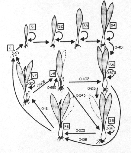
[3] Mathematically, a more ideal model would be somewhere between the discrete series function I used above and a set of continuous differential equations expressing the same concepts as well as accounting for stochasticity in the rates. Biologically, a more ideal model would include each life stage shown in the figure at right (encompassing sexual and vegetative reproduction) as well as realistic rates for each step.

It would be a relatively simple task to construct this sort of more detailed model, but properly determining all the rates would require extensive (presumably years-long) fieldwork. Thus, I'll leave this as an exercise for the reader.


Even though the models we discussed here are incomplete, they are informative. The big lesson is that the harvesting of Ramps from publicly accessible places is a nice example of a tragedy of the commons. There really isn't a harvesting percentage that can be used as a rule of thumb to tell people in the various forums.

If you have a large patch on your own land, then you can probably harvest a decent amount each year and the patch will never be at risk. Our hypothetical model [3] above might be able to tell us precisely how much of a population could be sustainably harvested, but without all the additional information it isn't worth worrying over. You can simply pay attention to how much you harvest and notice if the patch is dwindling or not from year to year. As it is your own patch, which you find valuable, you will adjust your personal harvest rate to allow the patch to prosper.

Is there anything we can encourage foragers to do, aside from simply advising them to leave the plants alone? If you harvest only one leaf from each mature plant (never the last leaf, or from small plants), without disturbing the bulb and roots, then the plants will survive and spread each year. If everyone followed this rule, large patches of Ramps could be maintained in woodlands close to or even within large cities. Convincing people to do this will be a difficult task.


References:

Monday, August 15, 2016

Mathematical Recreations : Ramanujan's Nested Radical 3

I've previously discussed an interesting math problem posed by Srinivasa Ramanujan way back in 1911.

In this third posting on this topic, I'll present a proof that there are an infinite number of valid solutions to his puzzle.

\( x = \sqrt{1+2\sqrt{1+3\sqrt{1+4\sqrt{\cdots}}}} \)


Ramanujan said the solution was \( \{x=3\} \). I'm claiming the proper solution is \( \{x=3+n : n \ge 0\} \). Lets see how that works out.

\( 3+n = \sqrt{1+2\sqrt{1+3\sqrt{1+4\sqrt{\cdots}}}} \)

We start by unwrapping the first few radicals and simplifying a bit.

\( \sqrt{1+3\sqrt{1+4\sqrt{\cdots}}} = \frac{(3+n)^2 -1}{2} = \frac{9+6n+n^2-1}{2} = 4+3n+\frac{1}{2}n^2 \)

\( \sqrt{1+4\sqrt{1+5\sqrt{\cdots}}} = \frac{(4+3n+\frac{1}{2}n^2)^2 -1}{3} = \frac{16+24n+13n^2+3n^3+\frac{1}{4}n^4-1}{3} = 5+8n+\frac{13}{3}n^2+n^3+\frac{1}{12}n^4 \)

If we work out the full radical at each step, we rapidly end up with very high-order polynomials on the right side of the equation. However, the 0th and 1st order terms will always only depend on the 0th and 1st order term of the polynomial for the previous radical. Since we're only working with values of n greater than zero, all of the higher-order terms [in red] will have positive values.

\( \sqrt{1+3\sqrt{1+4\sqrt{\cdots}}} = 4+3n \color{red}{+ \frac{1}{2}n^2} \)

\( \sqrt{1+4\sqrt{1+5\sqrt{\cdots}}} = 5+8n \color{red}{+ \frac{13}{3}n^2+n^3+\frac{1}{12}n^4} \)

This allows us to simply discard them, converting the equations into inequalities. This cleans up our work a lot.

\( \sqrt{1+3\sqrt{1+4\sqrt{\cdots}}} \ge 4+3n \)

\( \sqrt{1+4\sqrt{1+5\sqrt{\cdots}}} \ge 5+8n \)

Unwrap another radical. I'm using a bit of an unusual notation in the right half of the inequality, where I'm using equalities inside of the large parentheses for keeping track of a few steps of simplification.

\( \sqrt{1+5\sqrt{1+6\sqrt{\cdots}}} \ge \left(\frac{(5+8n)^2 -1}{4} = \frac{25+80n+64n^2-1}{4} = 6+20n+16n^2\right) \)

\( \sqrt{1+5\sqrt{1+6\sqrt{\cdots}}} \ge 6+20n\color{red}{+16n^2} \)

Since we already have an inequality, we can go ahead and discard this higher-order term.

\( \sqrt{1+5\sqrt{1+6\sqrt{\cdots}}} \ge 6+20n \)

The first order terms of the polynomials increase with each unwrapping of a radical. These terms form a series that has very simple behavior.

\( \left[ k_0 = 1; k_m = 2k_{m-1}+2^{m-1} \right] \)

\( \lim\limits_{m \to \infty} k_m = \infty \)

Because the trimmed polynomials representing each successive radical are <= the true polynomials, and they increase towards infinity, the true polynomials also increase towards infinity.


Unwrapping successive radicals from Ramanujan's solution results in a simple series that races upwards to infinity.

\( [3, 4, 5, 6, 7, \cdots, \infty ] \)

Unwrapping successive radicals from my solution results in a more complicated series that also races upwards to infinity.

\( [3+1n, 4+3n\color{red}{[+\cdots]}, 5+8n\color{red}{[+\cdots]}, 6+20n\color{red}{[+\cdots]}, 7+48n\color{red}{[+\cdots]}, \cdots, \infty ] \)

As long as the value of 'n' is greater than zero, no contradictions (such as negative values for a radical) arise, thus Ramanujan's solution to his puzzle is incomplete.


Figure showing series of curves. Those that follow a line and then curve upwards are drawn in green. Those that follow the line and then curve downwards are drawn in red.
Profiles from valid solutions (>= 3) are in green.
Profiles from invalid solutions (< 3) are in red.
Note the change in scale above and below zero.
A more complete solution is:

\( \sqrt{1+2\sqrt{1+3\sqrt{1+4\sqrt{\cdots}}}} \ge 3 \)

Ramanujan's puzzle remains of interest to many and seems to inspire ongoing conversations in various online forums. I have come across a few discussions where people mention calculating subsequent radicals for different starting values, the method at the root of my proof, but I've never come across anyone discussing an actual proof. Ramanujan's solution to his puzzle held for 115 years, but I've now proven his solution to be incomplete. I wonder how long it will take for my proof to start appearing in some of those forum discussions.

Unfortunately, my solution remains incomplete. As of yet, I do not have a proof to back up my intuition that all values less than three are invalid solutions. The method of proof I used here is not simply applied to show values less than 3 are invalid solutions, but I am pondering on methods of doing so.

Stay tuned for further developments.


References