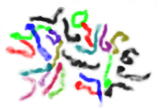
 The figure at left shows the metaphase chromosomes of a pepper root-tip, in all their squiggly false-color glory. In it you can count the number of chromosomes and (with some little background research) determine the overall ploidy of the source plant. (It has 24 chromosomes, so is a diploid.)
The original image had all the same information, but it was much harder to look at and learn from. This is a fundamental lesson of, and reason for, data visualization.
 |
| Step 0. |
Lets dive into the details of how I made my figure. I use GIMP for essentially all my image editing needs. With each step figure I'll include the menu options for each command I use in brackets, so others can repeat the procedure.
0) Load the image with GIMP. Open "Tool Options" [Control-B] and "Layers" [Control-L] windows.
| ||
|
 |
| Step 2. |
3) Right-click on the image in the layer window. Select, "Add Alpha Channel". Discard the color information in the image [Colors > Desaturate]. Remove the background color [Colors > Color to Alpha (Set "From:" color to white.)].
 |
| Step 4. |
 |
| Step 5. |
 |
| Step 6. |
 |
| Step 7. |
 |
| Step 8. |
8) Going progressively through the image, isolating and coloring the most apparent chromosomes at each stage, we come to 16 chromosomes that we can be confident about. (So, our cell isn't a haploid with 12 chromosomes.)
We're left with the region at left I've highlighted in pink. This region would need to account for a further 8 chromosomes to reach the expected diploid count of 24 in total. Though there are probably a few chromosomes in this region that we can confidently separate, much of it is down to guesswork.
It is possible for this specific pepper plant to have fewer chromosomes. Though it is unlikely for a chromosome pair to be lost, since each has been conserved over a long time period and likely contains critical genes, it is common enough evolutionarily for chromosomes to fuse. That pink mess could hypothetically be 6 or 4 chromosomes, though this one image isn't sufficient evidence to make me think it is likely. If the same pattern is shown in a few more images from the same plant, especially if the chromosomes are better spread, then I'd start to consider that as increasingly likely.
For now, the balance of the evidence leads me to think there are 24 chromosomes and they're just not perfectly isolated. So, I divided the uncertain pile of chromosomes into the number that I expect are remaining. Any figure you make will invariably include your assumptions. The key is to try and make those assumptions reasonable or at least apparent to the reader (though this may require some nice caption-writing).
Interestingly, there's a protocol which can experimentally produce the sorts of painted chromosomes we're simulating here. Fluorescent In-Situ Hybridization (FISH) relies on making DNA probes which are stained a unique color for each chromosome. When the probes are applied to a chromosome spread, the result helps visualize chromosome crossovers, deletions, and other large scale alterations that can be important in diagnosing cancer and other disorders. The setup work for this is pretty intense, so it's probably not going to be used for the simple task of seeing how many chromosomes a plant has.
While I was in grad school, I routinely modified figures from papers I was reviewing for in-class (or in-lab) presentations. Usually highlighting different components of the figure in different colors (like here), to make them stand out more when displayed. I was doing the hard work of figuring out the important parts of the figures so students watching my presentation didn't have to. My goal was for them to focus on what I was saying about the figures and see what wanted them to see at a glance.
Using colors to present different partitions of a larger dataset ended up being central to my last large graduate project (YMAP) as well as an important part of my current [non-academic] job. While using colors for data presentation, it is important to keep in mind that not everyone has the same ability to see color. The most common forms of color-blindness are often called Red-Green-colorblindness. From this, it is a good idea to try and avoid the commonly used Red-Green color scheme seen so often in biology research figures. (Blue-Yellow is a good alternative, but there are subtleties I'll have to go into later.) Being conscious of the issues means they will inform your decisions, even if you're not fully aware of the topic.
This post was inspired by a conversation over on Twitter. (You can follow me there as @thebiologistisn.)
#pepper root tip squash, farmer's fixative, aceto-orcein stain. Top: 400x, bottom: middle left spread, 1000x. @ukitel_ My problem, don't get reliable, countable spreads. @jmahoney515 Not sure about woody plants, what is the issue? #science #photography #cytogenetics pic.twitter.com/gpxiCc4ppM— ChaoticGenetics (@ChaoticGenetics) February 4, 2018
The original picture of the chromosome spread was made by
References:
- twitter.com/ChaoticGenetics
- Starting image: twitter.com/ChaoticGenetics/status/960242439746306048
- GIMP: www.gimp.org/
- Pepper chromosome counts: www.plantsciences.ucdavis.edu/vc221/pepper/pepperrd.htm
- Yeast Mapping Analysis Pipeline (YMAP): genomemedicine.biomedcentral.com/articles/10.1186/s13073-014-0100-8
- Fluorescent In-Situ Hybridization (FISH): www.nature.com/scitable/topicpage/fluorescence-in-situ-hybridization-fish-327


No comments:
Post a Comment